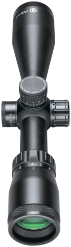
The Prime 3-12×40 Straight Wall Multi-Turret riflescope comes with BDC turrets for 350 Legend and 450 Marlin.
/* FONTS AND COLORS */
body {
font-family: Arial,sans-serif;
font-size: 14px;
line-height: 1.428571429;
color: #333;
background-color: white;
}
h1, h2, h3, h4, h5, h6 {
color: black;
}
.navbar a, .navbar a:active, .navbar a:hover, .navbar a:visited {
color: #333;
}
.product-specs {
background-color: #f1f1f1;
padding: 1em;
}
.product-specs td {
font-size:12px;
}
.attr-left {
min-width:6em;
font-weight:bold;
vertical-align:top;
}
.attr-right {
vertical-align:top;
}
div.footer {
border-top: 1px solid #f1f1f1;
}
.navbar-default {
background-image: -webkit-linear-gradient(top, #ffffff 0%, #f2f2f2 100%);
background-image: linear-gradient(to bottom, #ffffff 0%, #f2f2f2 100%);
background-repeat: repeat-x;
border-radius: 4px;
-webkit-box-shadow: inset 0 1px 0 rgba(255, 255, 255, 0.15), 0 1px 5px rgba(0, 0, 0, 0.075);
box-shadow: inset 0 1px 0 rgba(255, 255, 255, 0.15), 0 1px 5px rgba(0, 0, 0, 0.075);
}
.navbar-default .navbar-nav > .active > a {
background-image: -webkit-linear-gradient(top, #ebebeb 0%, #f3f3f3 100%);
background-image: linear-gradient(to bottom, #ebebeb 0%, #f3f3f3 100%);
background-repeat: repeat-x;
-webkit-box-shadow: inset 0 3px 9px rgba(0, 0, 0, 0.075);
box-shadow: inset 0 3px 9px rgba(0, 0, 0, 0.075);
}
/* LAYOUT – CHANGING THESE WILL AFFECT THE SIZE AND LAYOUT OF YOUR AD TEMPLATE */
/* Responsive Columns */
.col-md-6{width:100%;}
.col-md-12{width:100%;}
.container{margin:auto;width:100%;}
@media (min-width:768px){
.container{width:750px;}
.col-md-12, .col-md-6{float:left;}
.col-md-6{width:48%; margin:1%;}
}
@media (min-width:992px){
.container{width:970px;}
.col-md-12,.col-md-6{float:left;}
.col-md-6{width:48%; margin:1%;}
}
@media (min-width:1200px){
.container{width:1170px;}
.col-md-12,.col-md-6{float:left;}
.col-md-6{width:48%; margin:1%;}
}
.img-responsive{display:block;height:auto;max-width:100%;}
/* Responsive Navigation Bar */
.nav{padding-left:0;margin-bottom:0;list-style:none;}
.nav:before, .nav:after{display:table;content:” “;}
.nav:after{clear:both;}
.nav:before, .nav:after{display:table;content:” “;}
.nav:after{clear:both;}
.nav > li{position:relative;display:block;}
.nav > li > a{position:relative;display:block;padding:10px 15px;}
.nav > li > a:hover, .nav > li > a:focus{text-decoration:none;background-color:#eeeeee;}
.nav > li > a > img{max-width:none;}
.navbar{position:relative;min-height:50px;margin-bottom:20px;border:1px solid transparent;}
@media (min-width:768px){.navbar{border-radius:4px;}
}
.navbar-header:before, .navbar-header:after{display:table;content:” “;}
.navbar-header:after{clear:both;}
.navbar-header:before, .navbar-header:after{display:table;content:” “;}
.navbar-header:after{clear:both;}
@media (min-width:768px){.navbar-header{float:center;}
}
.navbar-collapse{max-height:340px;padding-right:15px;padding-left:15px;overflow-x:visible;border-top:1px solid transparent;box-shadow:inset 0 1px 0 rgba(255,255,255,0.1);-webkit-overflow-scrolling:touch;}
.navbar-collapse:before, .navbar-collapse:after{display:table;content:” “;}
.navbar-collapse:after{clear:both;}
.navbar-collapse:before, .navbar-collapse:after{display:table;content:” “;}
.navbar-collapse:after{clear:both;}
.navbar-collapse.in{overflow-y:auto;}
@media (min-width:768px){.navbar-collapse{width:auto;border-top:0;box-shadow:none;}
.navbar-collapse.collapse{display:block !important;height:auto !important;padding-bottom:0;overflow:visible !important;}
.navbar-collapse.in{overflow-y:visible;}
}
@media (min-width:768px){.container > .navbar-header, container > .navbar-collapse{margin-right:0;margin-left:0;}
}
.navbar-brand{float:left;padding:15px 15px;font-size:18px;line-height:20px;}
.navbar-brand:hover, .navbar-brand:focus{text-decoration:none;}
@media (min-width:768px){.navbar > .container .navbar-brand{margin-left:-15px;}
}
.navbar-nav{margin:7.5px -15px;}
.navbar-nav > li > a{padding-top:10px;padding-bottom:10px;line-height:20px;}
@media (min-width:768px){.navbar-nav{float:left;margin:0;}
.navbar-nav > li{float:left;}
.navbar-nav > li > a{padding-top:15px;padding-bottom:15px;}
.navbar-nav.navbar-right:last-child{margin-right:-15px;}
}
@media (min-width:768px){.navbar-left{float:left !important;}
.navbar-right{float:right !important;}
}
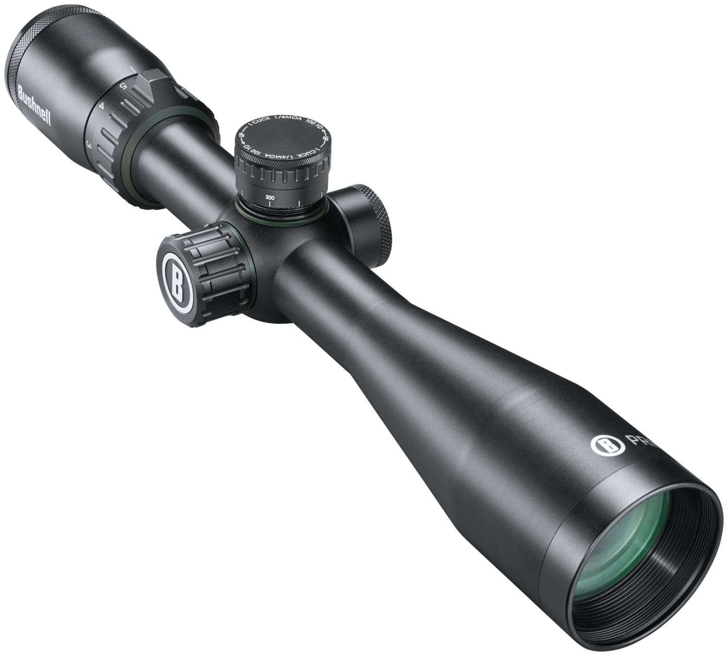
Bushnell Prime 3-12×40 CenterFire Multi-Turret Straight Wall Riflescope
244.99
The Prime 3-12×40 Multi-Turret is an unmatched value that includes a 350 Legend, 450 Marlin turret and a standard MOA turret.
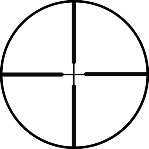
The Prime 3-12×40 Multi-Turret is a lightweight, compact, dual-purpose riflescope with multiple turrets, a simple Multi-X reticle, and has a side focus from 10 yards to infinity, and of course the 2 included turrets.
The Prime 3-12×40 uses fully multicoated optics, ultra-wide band coatings, and our exclusive EXO Barrier so you’ll always have a clear, bright, fog-free optic when it matters most. Turret caps are also there to guarantee you’ll never lose your turret position due to bumps and scrapes in the field.
This optic is IPX7 waterproof rated. Buy with confidence, it’s covered by our full lifetime Ironclad Warranty.
WHAT’S IN THE BOX: 3-12X40 PRIME RIFLESCOPE; QUICK START GUIDE; 1 350 LEGEND TURRET AND 1 450 BUSHMASTER TURRET; 1 SPUDZ™ LENS CLOTH.
Product Details
| Features |
- EXO Barrier bonds to exterior lens surfaces, and repels water, oil, fog, dust and debris making sure you can see your target in any condition.
- IPX7 Waterproof construction – O-ring sealed optics stay dry inside, when immersed in three feet of water for up to 30 minutes.
- Fully Multi Coated Optics – Multiple layers of coatings on all lens surfaces increase light transmission and image brightness.
|
| Condition |
New |
| Brand |
Bushnell |
| Warranty |
Ironclad Warranty |


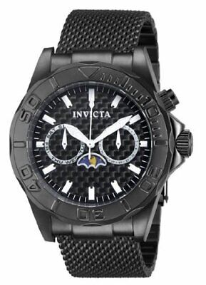 Invicta 80333 Men's Pro Diver Multi Function Quartz Black Watch
1 × $185.67
Invicta 80333 Men's Pro Diver Multi Function Quartz Black Watch
1 × $185.67  Invicta 16851 Women's Angel Diver Quartz Stainless Steel Bracelet Watch
1 × $80.29
Invicta 16851 Women's Angel Diver Quartz Stainless Steel Bracelet Watch
1 × $80.29  Casio Men Clean Outdoor Quartz Calendar Black Resin Band 46mm Watch MTPE190-9BV
1 × $64.39
Casio Men Clean Outdoor Quartz Calendar Black Resin Band 46mm Watch MTPE190-9BV
1 × $64.39 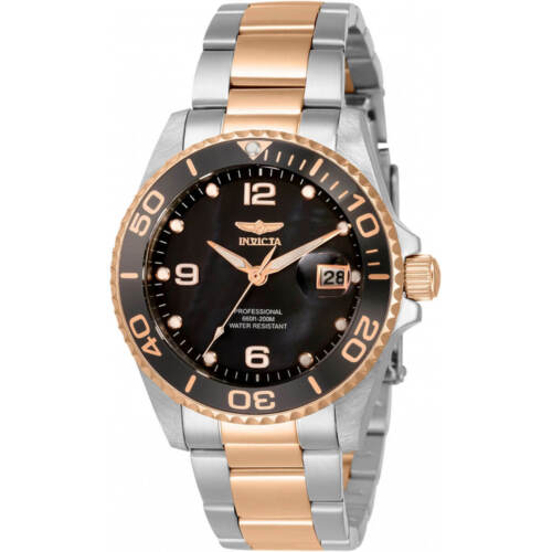 Invicta Women's Watch Pro Diver Quartz MOP Dial Two Tone Bracelet Dive 33264
1 × $77.44
Invicta Women's Watch Pro Diver Quartz MOP Dial Two Tone Bracelet Dive 33264
1 × $77.44  Lenovo 16GB TruDDR4 Memory Module
1 × $152.78
Lenovo 16GB TruDDR4 Memory Module
1 × $152.78  HP Wide Format Roll Paper Matte 36" x 300' (C6810A) 810764
1 × $120.15
HP Wide Format Roll Paper Matte 36" x 300' (C6810A) 810764
1 × $120.15 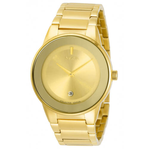 Invicta Men's Watch Specialty Quartz Gold Tone Dial Yellow Gold Bracelet 30535
1 × $96.76
Invicta Men's Watch Specialty Quartz Gold Tone Dial Yellow Gold Bracelet 30535
1 × $96.76 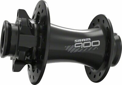 SRAM 900 Front Hub 32H 6-Bolt Disc Black A1
1 × $92.81
SRAM 900 Front Hub 32H 6-Bolt Disc Black A1
1 × $92.81 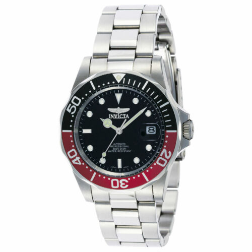 Invicta Men's Watch Pro Diver Automatic Black Dial Stainless Steel Bracelet 9403
1 × $104.47
Invicta Men's Watch Pro Diver Automatic Black Dial Stainless Steel Bracelet 9403
1 × $104.47  Invicta Men's Watch Pro Diver Black Dial Quartz Chronograph TT Bracelet 1772
1 × $93.26
Invicta Men's Watch Pro Diver Black Dial Quartz Chronograph TT Bracelet 1772
1 × $93.26 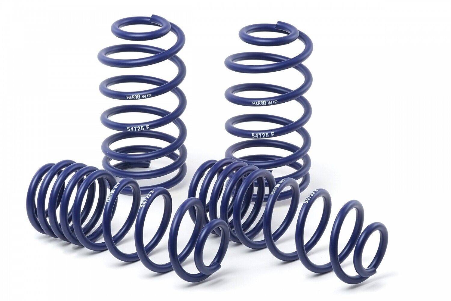 H&R Lowering Sport Spring Front 1.4'' Rear 1.3'' For 2007 - 2016 Volvo S80
1 × $288.83
H&R Lowering Sport Spring Front 1.4'' Rear 1.3'' For 2007 - 2016 Volvo S80
1 × $288.83 


There are no reviews yet.