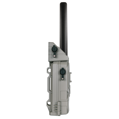
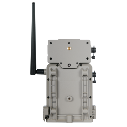
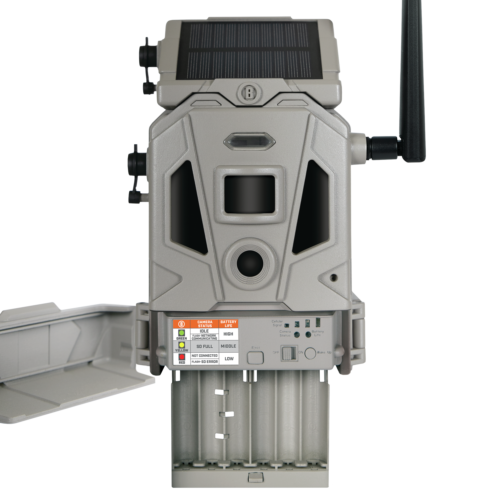
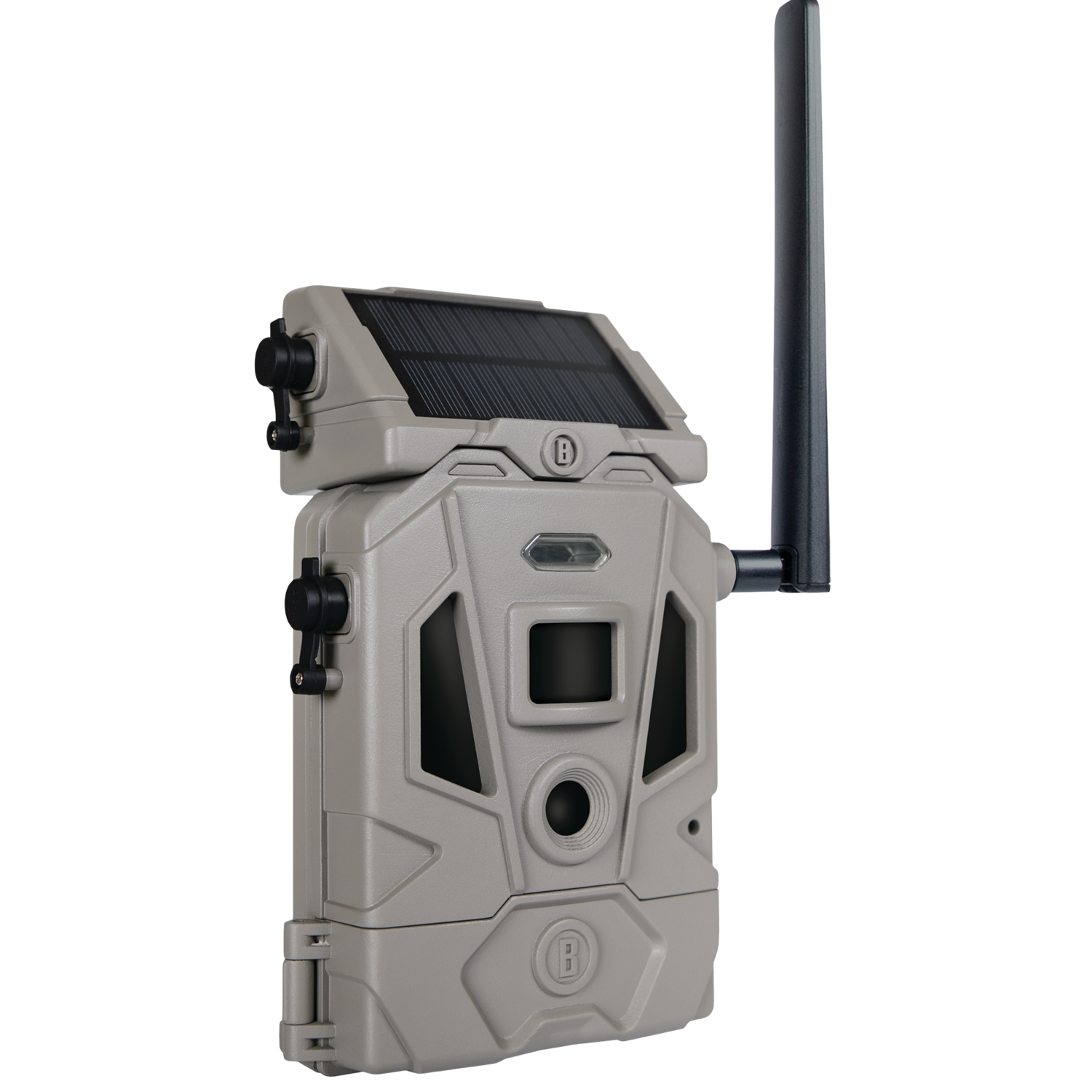
The CelluCORE™ 20 Solar Combines the reliability and image quality of the CelluCORE 20 with an integrated solar panel to dramatically increase battery life. The solar panel detaches so you can adjust it to face the sun’s strongest position. It includes a rechargeable lithium-ion battery and can maintain full charge for up to 70 images per day with adequate direct sun light. The Dual SIM configuration of the CelluCORE™ 20 Solar allows it to automatically connect to AT&T or Verizon−whichever offers the strongest cellular network based on your camera’s location. No need to compare with network strength maps! And thanks to its optimized antenna, you know you’re always getting the strongest cellular signal possible.
/* FONTS AND COLORS */
body {
font-family: Arial,sans-serif;
font-size: 14px;
line-height: 1.428571429;
color: #333;
background-color: white;
}
h1, h2, h3, h4, h5, h6 {
color: black;
}
.navbar a, .navbar a:active, .navbar a:hover, .navbar a:visited {
color: #333;
}
.product-specs {
background-color: #f1f1f1;
padding: 1em;
}
.product-specs td {
font-size:12px;
}
.attr-left {
min-width:6em;
font-weight:bold;
vertical-align:top;
}
.attr-right {
vertical-align:top;
}
div.footer {
border-top: 1px solid #f1f1f1;
}
.navbar-default {
background-image: -webkit-linear-gradient(top, #ffffff 0%, #f2f2f2 100%);
background-image: linear-gradient(to bottom, #ffffff 0%, #f2f2f2 100%);
background-repeat: repeat-x;
border-radius: 4px;
-webkit-box-shadow: inset 0 1px 0 rgba(255, 255, 255, 0.15), 0 1px 5px rgba(0, 0, 0, 0.075);
box-shadow: inset 0 1px 0 rgba(255, 255, 255, 0.15), 0 1px 5px rgba(0, 0, 0, 0.075);
}
.navbar-default .navbar-nav > .active > a {
background-image: -webkit-linear-gradient(top, #ebebeb 0%, #f3f3f3 100%);
background-image: linear-gradient(to bottom, #ebebeb 0%, #f3f3f3 100%);
background-repeat: repeat-x;
-webkit-box-shadow: inset 0 3px 9px rgba(0, 0, 0, 0.075);
box-shadow: inset 0 3px 9px rgba(0, 0, 0, 0.075);
}
/* LAYOUT – CHANGING THESE WILL AFFECT THE SIZE AND LAYOUT OF YOUR AD TEMPLATE */
/* Responsive Columns */
.col-md-6{width:100%;}
.col-md-12{width:100%;}
.container{margin:auto;width:100%;}
@media (min-width:768px){
.container{width:750px;}
.col-md-12, .col-md-6{float:left;}
.col-md-6{width:48%; margin:1%;}
}
@media (min-width:992px){
.container{width:970px;}
.col-md-12,.col-md-6{float:left;}
.col-md-6{width:48%; margin:1%;}
}
@media (min-width:1200px){
.container{width:1170px;}
.col-md-12,.col-md-6{float:left;}
.col-md-6{width:48%; margin:1%;}
}
.img-responsive{display:block;height:auto;max-width:100%;}
/* Responsive Navigation Bar */
.nav{padding-left:0;margin-bottom:0;list-style:none;}
.nav:before, .nav:after{display:table;content:” “;}
.nav:after{clear:both;}
.nav:before, .nav:after{display:table;content:” “;}
.nav:after{clear:both;}
.nav > li{position:relative;display:block;}
.nav > li > a{position:relative;display:block;padding:10px 15px;}
.nav > li > a:hover, .nav > li > a:focus{text-decoration:none;background-color:#eeeeee;}
.nav > li > a > img{max-width:none;}
.navbar{position:relative;min-height:50px;margin-bottom:20px;border:1px solid transparent;}
@media (min-width:768px){.navbar{border-radius:4px;}
}
.navbar-header:before, .navbar-header:after{display:table;content:” “;}
.navbar-header:after{clear:both;}
.navbar-header:before, .navbar-header:after{display:table;content:” “;}
.navbar-header:after{clear:both;}
@media (min-width:768px){.navbar-header{float:center;}
}
.navbar-collapse{max-height:340px;padding-right:15px;padding-left:15px;overflow-x:visible;border-top:1px solid transparent;box-shadow:inset 0 1px 0 rgba(255,255,255,0.1);-webkit-overflow-scrolling:touch;}
.navbar-collapse:before, .navbar-collapse:after{display:table;content:” “;}
.navbar-collapse:after{clear:both;}
.navbar-collapse:before, .navbar-collapse:after{display:table;content:” “;}
.navbar-collapse:after{clear:both;}
.navbar-collapse.in{overflow-y:auto;}
@media (min-width:768px){.navbar-collapse{width:auto;border-top:0;box-shadow:none;}
.navbar-collapse.collapse{display:block !important;height:auto !important;padding-bottom:0;overflow:visible !important;}
.navbar-collapse.in{overflow-y:visible;}
}
@media (min-width:768px){.container > .navbar-header, container > .navbar-collapse{margin-right:0;margin-left:0;}
}
.navbar-brand{float:left;padding:15px 15px;font-size:18px;line-height:20px;}
.navbar-brand:hover, .navbar-brand:focus{text-decoration:none;}
@media (min-width:768px){.navbar > .container .navbar-brand{margin-left:-15px;}
}
.navbar-nav{margin:7.5px -15px;}
.navbar-nav > li > a{padding-top:10px;padding-bottom:10px;line-height:20px;}
@media (min-width:768px){.navbar-nav{float:left;margin:0;}
.navbar-nav > li{float:left;}
.navbar-nav > li > a{padding-top:15px;padding-bottom:15px;}
.navbar-nav.navbar-right:last-child{margin-right:-15px;}
}
@media (min-width:768px){.navbar-left{float:left !important;}
.navbar-right{float:right !important;}
}
Bushnell Cellucore 20 Solar Cellular Trail Camera Dual SIM Configuration
149.99
The CelluCORE™ 20 Solar Combines the reliability and image quality of the CelluCORE 20 with an integrated solar panel to dramatically increase battery life. The solar panel detaches so you can adjust it to face the sun’s strongest position. It includes a rechargeable lithium-ion battery and can maintain full charge for up to 70 images per day with adequate direct sun light. The Dual SIM configuration of the CelluCORE™ 20 Solar allows it to automatically connect to AT&T or Verizon−whichever offers the strongest cellular network based on your camera’s location. No need to compare with network strength maps! And thanks to its optimized antenna, you know you’re always getting the strongest cellular signal possible.
Product Details
| Features |
- The integrated solar panel can be detached and positioned to face the strongest sun position
- Rechargeable lithium-ion batteries
- Maintains full charge for up to 70 images per day with adequate sunlight
- Dual SIM automatically connects to the strongest network signal ATT or Verizon
- Optimized antenna
- High output IR LEDs for best-in-class night range and battery life
- Sorts images by weather, wind, moon & more
- Make setting changes through your phone
- First 30 Days Free ($15 value)
- Sub 1 second trigger speed
- Crystal clear 20 MP images
- 80 ft night and detection range
- HD Video saved to SD card
- 12AA removable battery tray
- 2 Year Limited Warranty
|
| Condition |
New |
| Brand |
Bushnell |
| Warranty |
Two Year Limited (Materials & Workmanship) |


 Lenovo 16GB TruDDR4 Memory Module
1 × $152.78
Lenovo 16GB TruDDR4 Memory Module
1 × $152.78  Fire Tower Rising Flames Board Game Expansion (Deluxe Expansion with 2 Mini Expansions): Fight Fire with Fire (Base Game Required)
1 × $76.99
Fire Tower Rising Flames Board Game Expansion (Deluxe Expansion with 2 Mini Expansions): Fight Fire with Fire (Base Game Required)
1 × $76.99  Invicta Men's 44251 Specialty Quartz Chronograph Silver Dial Watch
1 × $152.87
Invicta Men's 44251 Specialty Quartz Chronograph Silver Dial Watch
1 × $152.87  HP Inc. HP 504A (CE253A) Magenta Original LaserJet Toner Cartridge
1 × $377.07
HP Inc. HP 504A (CE253A) Magenta Original LaserJet Toner Cartridge
1 × $377.07  Invicta Men's 38013 S1 Rally Quartz Multifunction Silver, Red Dial Watch
1 × $128.69
Invicta Men's 38013 S1 Rally Quartz Multifunction Silver, Red Dial Watch
1 × $128.69  HP Inc. HP 64 Black and Tri-color High Yield Original Ink Cartridges X4D92AN
1 × $68.63
HP Inc. HP 64 Black and Tri-color High Yield Original Ink Cartridges X4D92AN
1 × $68.63  Invicta Men's Pro Diver Collection Automatic Silver-Tone Watch 9404
1 × $110.54
Invicta Men's Pro Diver Collection Automatic Silver-Tone Watch 9404
1 × $110.54  Invicta Men's 43457 MLB Boston Red Sox Quartz Red, Silver, White Dial Watch
2 × $106.00
Invicta Men's 43457 MLB Boston Red Sox Quartz Red, Silver, White Dial Watch
2 × $106.00  Invicta 80333 Men's Pro Diver Multi Function Quartz Black Watch
1 × $185.67
Invicta 80333 Men's Pro Diver Multi Function Quartz Black Watch
1 × $185.67 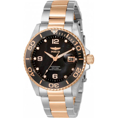 Invicta Women's Watch Pro Diver Quartz MOP Dial Two Tone Bracelet Dive 33264
1 × $77.44
Invicta Women's Watch Pro Diver Quartz MOP Dial Two Tone Bracelet Dive 33264
1 × $77.44 


There are no reviews yet.