
No products in the cart.

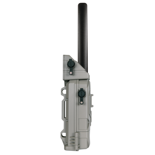
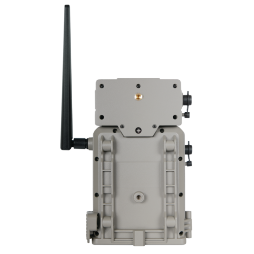

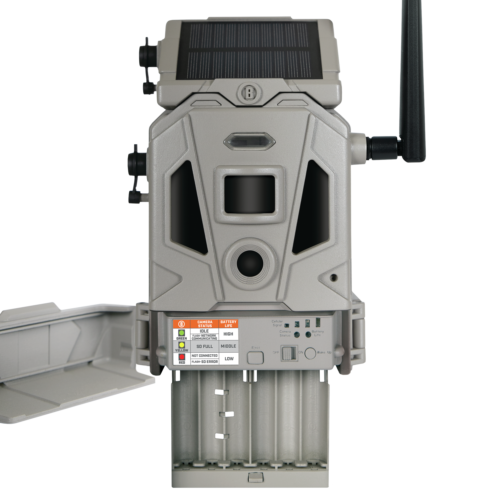
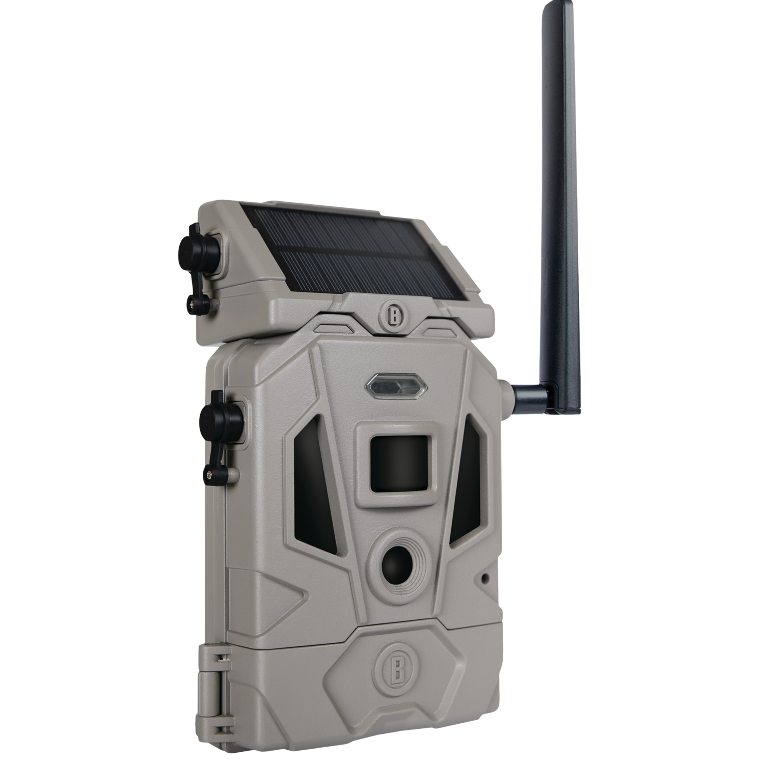
The CelluCORE™ 20 Solar Combines the reliability and image quality of the CelluCORE 20 with an integrated solar panel to dramatically increase battery life. The solar panel detaches so you can adjust it to face the sun’s strongest position. It includes a rechargeable lithium-ion battery and can maintain full charge for up to 70 images per day with adequate direct sun light. The Dual SIM configuration of the CelluCORE™ 20 Solar allows it to automatically connect to AT&T or Verizon−whichever offers the strongest cellular network based on your camera’s location. No need to compare with network strength maps! And thanks to its optimized antenna, you know you’re always getting the strongest cellular signal possible.
/* FONTS AND COLORS */
body {
font-family: Arial,sans-serif;
font-size: 14px;
line-height: 1.428571429;
color: #333;
background-color: white;
}
h1, h2, h3, h4, h5, h6 {
color: black;
}
.navbar a, .navbar a:active, .navbar a:hover, .navbar a:visited {
color: #333;
}
.product-specs {
background-color: #f1f1f1;
padding: 1em;
}
.product-specs td {
font-size:12px;
}
.attr-left {
min-width:6em;
font-weight:bold;
vertical-align:top;
}
.attr-right {
vertical-align:top;
}
div.footer {
border-top: 1px solid #f1f1f1;
}
.navbar-default {
background-image: -webkit-linear-gradient(top, #ffffff 0%, #f2f2f2 100%);
background-image: linear-gradient(to bottom, #ffffff 0%, #f2f2f2 100%);
background-repeat: repeat-x;
border-radius: 4px;
-webkit-box-shadow: inset 0 1px 0 rgba(255, 255, 255, 0.15), 0 1px 5px rgba(0, 0, 0, 0.075);
box-shadow: inset 0 1px 0 rgba(255, 255, 255, 0.15), 0 1px 5px rgba(0, 0, 0, 0.075);
}
.navbar-default .navbar-nav > .active > a {
background-image: -webkit-linear-gradient(top, #ebebeb 0%, #f3f3f3 100%);
background-image: linear-gradient(to bottom, #ebebeb 0%, #f3f3f3 100%);
background-repeat: repeat-x;
-webkit-box-shadow: inset 0 3px 9px rgba(0, 0, 0, 0.075);
box-shadow: inset 0 3px 9px rgba(0, 0, 0, 0.075);
}
/* LAYOUT – CHANGING THESE WILL AFFECT THE SIZE AND LAYOUT OF YOUR AD TEMPLATE */
/* Responsive Columns */
.col-md-6{width:100%;}
.col-md-12{width:100%;}
.container{margin:auto;width:100%;}
@media (min-width:768px){
.container{width:750px;}
.col-md-12, .col-md-6{float:left;}
.col-md-6{width:48%; margin:1%;}
}
@media (min-width:992px){
.container{width:970px;}
.col-md-12,.col-md-6{float:left;}
.col-md-6{width:48%; margin:1%;}
}
@media (min-width:1200px){
.container{width:1170px;}
.col-md-12,.col-md-6{float:left;}
.col-md-6{width:48%; margin:1%;}
}
.img-responsive{display:block;height:auto;max-width:100%;}
/* Responsive Navigation Bar */
.nav{padding-left:0;margin-bottom:0;list-style:none;}
.nav:before, .nav:after{display:table;content:” “;}
.nav:after{clear:both;}
.nav:before, .nav:after{display:table;content:” “;}
.nav:after{clear:both;}
.nav > li{position:relative;display:block;}
.nav > li > a{position:relative;display:block;padding:10px 15px;}
.nav > li > a:hover, .nav > li > a:focus{text-decoration:none;background-color:#eeeeee;}
.nav > li > a > img{max-width:none;}
.navbar{position:relative;min-height:50px;margin-bottom:20px;border:1px solid transparent;}
@media (min-width:768px){.navbar{border-radius:4px;}
}
.navbar-header:before, .navbar-header:after{display:table;content:” “;}
.navbar-header:after{clear:both;}
.navbar-header:before, .navbar-header:after{display:table;content:” “;}
.navbar-header:after{clear:both;}
@media (min-width:768px){.navbar-header{float:center;}
}
.navbar-collapse{max-height:340px;padding-right:15px;padding-left:15px;overflow-x:visible;border-top:1px solid transparent;box-shadow:inset 0 1px 0 rgba(255,255,255,0.1);-webkit-overflow-scrolling:touch;}
.navbar-collapse:before, .navbar-collapse:after{display:table;content:” “;}
.navbar-collapse:after{clear:both;}
.navbar-collapse:before, .navbar-collapse:after{display:table;content:” “;}
.navbar-collapse:after{clear:both;}
.navbar-collapse.in{overflow-y:auto;}
@media (min-width:768px){.navbar-collapse{width:auto;border-top:0;box-shadow:none;}
.navbar-collapse.collapse{display:block !important;height:auto !important;padding-bottom:0;overflow:visible !important;}
.navbar-collapse.in{overflow-y:visible;}
}
@media (min-width:768px){.container > .navbar-header, container > .navbar-collapse{margin-right:0;margin-left:0;}
}
.navbar-brand{float:left;padding:15px 15px;font-size:18px;line-height:20px;}
.navbar-brand:hover, .navbar-brand:focus{text-decoration:none;}
@media (min-width:768px){.navbar > .container .navbar-brand{margin-left:-15px;}
}
.navbar-nav{margin:7.5px -15px;}
.navbar-nav > li > a{padding-top:10px;padding-bottom:10px;line-height:20px;}
@media (min-width:768px){.navbar-nav{float:left;margin:0;}
.navbar-nav > li{float:left;}
.navbar-nav > li > a{padding-top:15px;padding-bottom:15px;}
.navbar-nav.navbar-right:last-child{margin-right:-15px;}
}
@media (min-width:768px){.navbar-left{float:left !important;}
.navbar-right{float:right !important;}
}
Bushnell Cellucore 20 Solar Cellular Trail Camera Dual SIM Configuration
149.99
The CelluCORE™ 20 Solar Combines the reliability and image quality of the CelluCORE 20 with an integrated solar panel to dramatically increase battery life. The solar panel detaches so you can adjust it to face the sun’s strongest position. It includes a rechargeable lithium-ion battery and can maintain full charge for up to 70 images per day with adequate direct sun light. The Dual SIM configuration of the CelluCORE™ 20 Solar allows it to automatically connect to AT&T or Verizon−whichever offers the strongest cellular network based on your camera’s location. No need to compare with network strength maps! And thanks to its optimized antenna, you know you’re always getting the strongest cellular signal possible.
Product Details
| Features |
|
| Condition | New |
| Brand | Bushnell |
| Warranty | Two Year Limited (Materials & Workmanship) |
Based on 0 reviews
Only logged in customers who have purchased this product may leave a review.


There are no reviews yet.