
-
×
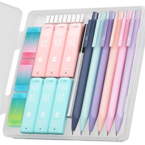 Four Candies Cute Mechanical Pencil Set, 6PCS Pastel Pencils 0.5mm & 0.7mm with 360PCS HB Pencil Leads, 3PCS Erasers and 9PCS Eraser Refills, Aesthetic Mechanical Pencils for Girls Writing
1 × $30.99
Four Candies Cute Mechanical Pencil Set, 6PCS Pastel Pencils 0.5mm & 0.7mm with 360PCS HB Pencil Leads, 3PCS Erasers and 9PCS Eraser Refills, Aesthetic Mechanical Pencils for Girls Writing
1 × $30.99 -
×
 Invicta Men's Pro Diver Grey Dial Stainless Steel Bracelet Quartz Watch 22050
1 × $67.05
Invicta Men's Pro Diver Grey Dial Stainless Steel Bracelet Quartz Watch 22050
1 × $67.05 -
×
 SEMKONT Cigar Humidor, Portable Travel Cigar Box, Double Cigar Humidor with Separate Storage for Cigar Accessories, Cigar Travel Case with Cigar Lighter and Humidifier, Holds 5 Cigars (Black)
1 × $41.98
SEMKONT Cigar Humidor, Portable Travel Cigar Box, Double Cigar Humidor with Separate Storage for Cigar Accessories, Cigar Travel Case with Cigar Lighter and Humidifier, Holds 5 Cigars (Black)
1 × $41.98 -
×
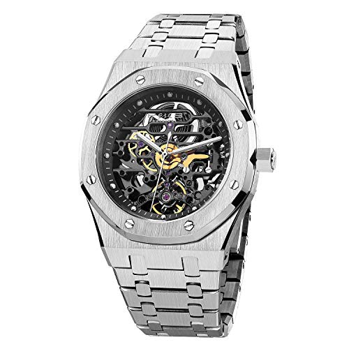 FEICE Watches for Men Automatic Skeleton Watch 42mm Case Stainless Steel Mechanical Anti Shock Waterproof Luminous Sapphire Crystal Analog Watches Business Wristwatch Adjustable Band FM019HOT
1 × $234.99
FEICE Watches for Men Automatic Skeleton Watch 42mm Case Stainless Steel Mechanical Anti Shock Waterproof Luminous Sapphire Crystal Analog Watches Business Wristwatch Adjustable Band FM019HOT
1 × $234.99 -
×
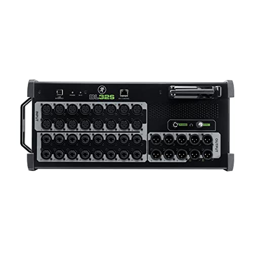 Mackie DL32S DL Series 32-Channel Digital Wireless Live Sound Mixer with Built-In Wi-Fi and Onyx+ Mic Preamps
1 × $1,514.99
Mackie DL32S DL Series 32-Channel Digital Wireless Live Sound Mixer with Built-In Wi-Fi and Onyx+ Mic Preamps
1 × $1,514.99 -
×
 Bgraamiens Puzzle-Geometric Colorful Mandala-1000 Pieces Creative Geometric Round Blue Board Colorful Mandala Jigsaw Puzzle
1 × $33.99
Bgraamiens Puzzle-Geometric Colorful Mandala-1000 Pieces Creative Geometric Round Blue Board Colorful Mandala Jigsaw Puzzle
1 × $33.99 -
×
 Invicta 17484 Women's Angel Silver Dial White Rubber Strap Watch
1 × $62.03
Invicta 17484 Women's Angel Silver Dial White Rubber Strap Watch
1 × $62.03 -
×
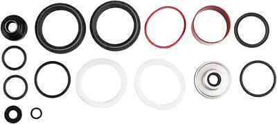 RockShox 200 HOUR/1 YEAR SERVICE KIT
1 × $64.34
RockShox 200 HOUR/1 YEAR SERVICE KIT
1 × $64.34 -
×
 Warn Industries Latch Base ATV ProVantage Plow #81273
1 × $50.78
Warn Industries Latch Base ATV ProVantage Plow #81273
1 × $50.78 -
×
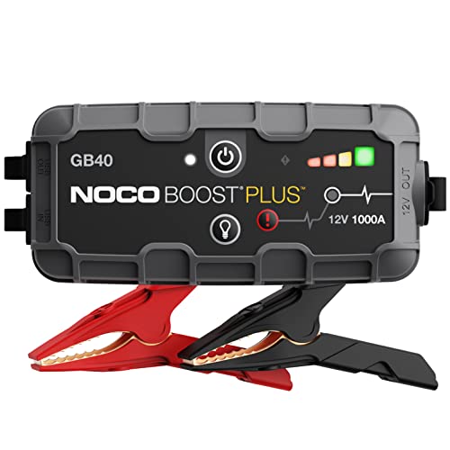 NOCO Boost Plus GB40 1000A UltraSafe Car Battery Jump Starter, 12V Battery Pack, Battery Booster, Jump Box, Portable Charger and Jumper Cables for 6.0L Gasoline and 3.0L Diesel Engines, Gray
1 × $114.95
NOCO Boost Plus GB40 1000A UltraSafe Car Battery Jump Starter, 12V Battery Pack, Battery Booster, Jump Box, Portable Charger and Jumper Cables for 6.0L Gasoline and 3.0L Diesel Engines, Gray
1 × $114.95 -
×
 Car Vacuum 15000PA 3 IN 1 Brushless Motor Handheld Vacuum Cordless Rechargeable Portable Mini Wireless Vacuum Cleaner Car Accessories for Men, Women,Car,Desktop Home Cleaning (Silver Grey)
1 × $74.79
Car Vacuum 15000PA 3 IN 1 Brushless Motor Handheld Vacuum Cordless Rechargeable Portable Mini Wireless Vacuum Cleaner Car Accessories for Men, Women,Car,Desktop Home Cleaning (Silver Grey)
1 × $74.79 -
×
 10PC Double Cut Carbide Burr Set 0.118" (3mm) Shank, Rotary Tool Bits Cutting Burrs - Dremel Accessories Fordom, Flex Shaft, Dewalt And Die Grinders - Wood Carving bits Metal Working And Engraving
1 × $34.89
10PC Double Cut Carbide Burr Set 0.118" (3mm) Shank, Rotary Tool Bits Cutting Burrs - Dremel Accessories Fordom, Flex Shaft, Dewalt And Die Grinders - Wood Carving bits Metal Working And Engraving
1 × $34.89 -
×
 Firefighter Gifts For Men From Family Member, Wife, Close Friend - 20oz Firefighter Tumbler - Father's Day Gifts For Firefighter | Birthday, Graduation, Retirement, Appreciation Gifts For Firefighter
1 × $44.99
Firefighter Gifts For Men From Family Member, Wife, Close Friend - 20oz Firefighter Tumbler - Father's Day Gifts For Firefighter | Birthday, Graduation, Retirement, Appreciation Gifts For Firefighter
1 × $44.99 -
×
 HORIBA LAQUAtwin NO3-11 Compact Nitrate Ion Meter for Water, Viscous Liquids, Solids, and Powder Samples
1 × $400.00
HORIBA LAQUAtwin NO3-11 Compact Nitrate Ion Meter for Water, Viscous Liquids, Solids, and Powder Samples
1 × $400.00 -
×
 Hair Scissors 6.5 Inch,Professional Black Gold Hair Cutting Scissors Shears,Stainless Steel Barber Scissors Supplies, for Salons, Professional Barbers, Men & Women, Kids, Adults, & Pets
1 × $19.99
Hair Scissors 6.5 Inch,Professional Black Gold Hair Cutting Scissors Shears,Stainless Steel Barber Scissors Supplies, for Salons, Professional Barbers, Men & Women, Kids, Adults, & Pets
1 × $19.99 -
×
 Car Key Chain with 2 Key Rings Set of 2, Carabiner Key Chain Bottle Opener for Men and Women (Gun Color and Golden).
1 × $23.99
Car Key Chain with 2 Key Rings Set of 2, Carabiner Key Chain Bottle Opener for Men and Women (Gun Color and Golden).
1 × $23.99 -
×
 XPPen Drawing Tablet Stand AC18 Multifunctional Metal Drawing Pen Tablet Stand for Pen Display Drawing Graphic Monitor Prevented Skidding Stander Holder
1 × $64.99
XPPen Drawing Tablet Stand AC18 Multifunctional Metal Drawing Pen Tablet Stand for Pen Display Drawing Graphic Monitor Prevented Skidding Stander Holder
1 × $64.99 -
×
 Tabac Original Shaving Soap and Bowl
1 × $41.99
Tabac Original Shaving Soap and Bowl
1 × $41.99 -
×
 MILAKOO Mix 6 Wrap Braided Bracelets Men Women, Friendship Bracelet Hemp Cords Adjustable
1 × $24.99
MILAKOO Mix 6 Wrap Braided Bracelets Men Women, Friendship Bracelet Hemp Cords Adjustable
1 × $24.99
Subtotal: $2,946.71


%20for%20Mouse%20and%20Keyboard%20Control%20Remote%20Signals&url=https://www.getasave.com/product/hdmi-kvm-usb-extender-transmit-1080p-hd-video-over-cat5e-6-ethernet-cable-50m-164ft-for-mouse-and-keyboard-control-remote-signals/&media=https://i0.wp.com/m.media-amazon.com/images/I/414DZgXefEL.jpg?fit=1024%2C1024&ssl=1)
%20–%20Set%20of%202%20and%20Slide%20Free%20Pad%20and%20Light&url=https://www.getasave.com/product/drop-stop-the-original-patented-car-seat-gap-filler-as-seen-on-shark-tank-set-of-2-and-slide-free-pad-and-light/&media=https://i0.wp.com/m.media-amazon.com/images/I/51vr49XwDlL.jpg?fit=1024%2C1024&ssl=1)
There are no reviews yet.